 Sahil K
Why Reports & Dashboards Are the Core of CRM Value
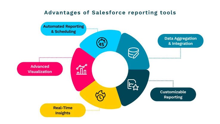
Salesforce holds a goldmine of your business data — leads, opportunities, customer interactions, service tickets, revenue pipelines. But raw records sitting in list views are not insightful. Reports and dashboards are the bridge between data you store and decisions you make.
When used well, they answer the questions every leader is actually asking: Are we on track to hit quota? Where is the pipeline stalling? Which customers are at risk? The goal is not just pretty charts — it is organizational alignment around a shared, trusted view of reality.
Understanding the Difference: Reports vs. Dashboards
Before diving into best practices, it helps to be clear about what each tool does:
Reports
Detailed, filterable lists or summaries of your data. Think of them as the raw analytical layer — you define which records to include, how to group them, and what metrics to show. Salesforce offers four report types: Tabular, Summary, Matrix, and Joined.
Dashboards
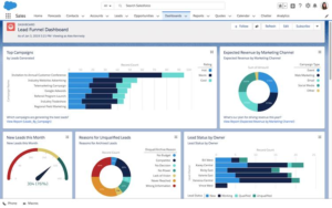
Visual summaries of one or more reports, displayed as charts, gauges, tables, and metrics — all in one view. They are designed for at-a-glance consumption by stakeholders who need a quick read on performance without drilling into data.
5 Ways Reports Drive Better Decisions
- Pipeline Visibility and Forecast Accuracy
Build opportunity reports filtered by close date, stage, and owner. Group by month and use summary rows to see weighted pipeline totals. When leadership can see where deals are stalling in real time, forecast calls become data-backed conversations instead of gut-feel guesses.
- Sales Rep Performance Tracking
A summary report grouped by rep — showing activities logged, opportunities created, and revenue closed — gives managers an objective basis for coaching. Pair it with a leaderboard dashboard component and you create healthy, visible accountability.
- Lead Conversion Analysis
Marketing teams can use leads reports filtered by source to compare conversion rates across campaigns. If paid social converts at 2% and webinars convert at 12%, that is a budget reallocation decision hiding in your data.
- Customer Health and Churn Indicators
Service and CS teams can build reports on case volume, resolution times, and escalation frequency per account. High case counts plus an upcoming renewal is an early warning signal — catchable only if someone is looking at the data regularly.
- Cross-Functional Alignment
A shared dashboard embedded in a Salesforce Home Page or sent as a scheduled email report ensures that sales, marketing, and service are all looking at the same numbers. Disagreements about performance become less common when everyone starts from the same source of truth.
Building Reports That Are Actually Useful
Most Salesforce orgs have hundreds of reports — and most of them are never opened. The difference between a report that drives action and one that collects digital dust comes down to a few disciplines:
- Define the business question first. Before opening Report Builder, write down the question you need to answer. The question determines your report type, filters, and groupings.
- Use filters aggressively. An unfiltered report on All Opportunities is noise. A report on open opportunities closing this quarter in EMEA owned by active reps is signal.
- Add custom summary formulas. Win rate, average deal size, days in stage — these are one formula away from being visible in your reports.
- Name reports for their audience. Q3 Pipeline Review — VP Sales is infinitely more findable than Opps Report v3 final.
- Schedule subscriptions for key stakeholders. Reports land in inboxes automatically so no one needs to remember to check.
Dashboard Design Tips for Executives
An effective dashboard should answer three questions within 30 seconds:
- What is happening?
- Why is it happening?
- What action should we take?
Best practices include:
✔ Limit dashboard components to key KPIs
✔ Use consistent chart types
✔ Highlight trends instead of raw numbers
✔ Organize components by business priority
✔ Keep the design simple and executive-friendly
Remember: the goal is clarity, not complexity.
Conclusion
Salesforce Reports and Dashboards are far more than reporting tools—they are decision-making tools.
Organizations that consistently use analytics gain deeper visibility into performance, identify risks earlier, optimize processes faster, and make smarter strategic decisions.
The most successful teams don’t just collect data. They use Salesforce Analytics to turn data into action and action into business results.
“Data tells you what happened. Salesforce Analytics helps you decide what to do next.”
Ye version blog post, LinkedIn article, company website, ya Salesforce portfolio showcase ke liye kaafi professional lagega.